You are reading docs for v1.3.1, click here for the latest version.
- introduction
- getting-started
- routing
- utilities
- elements:layouts
- elements:action-bar
- elements:components
- elements:dialogs
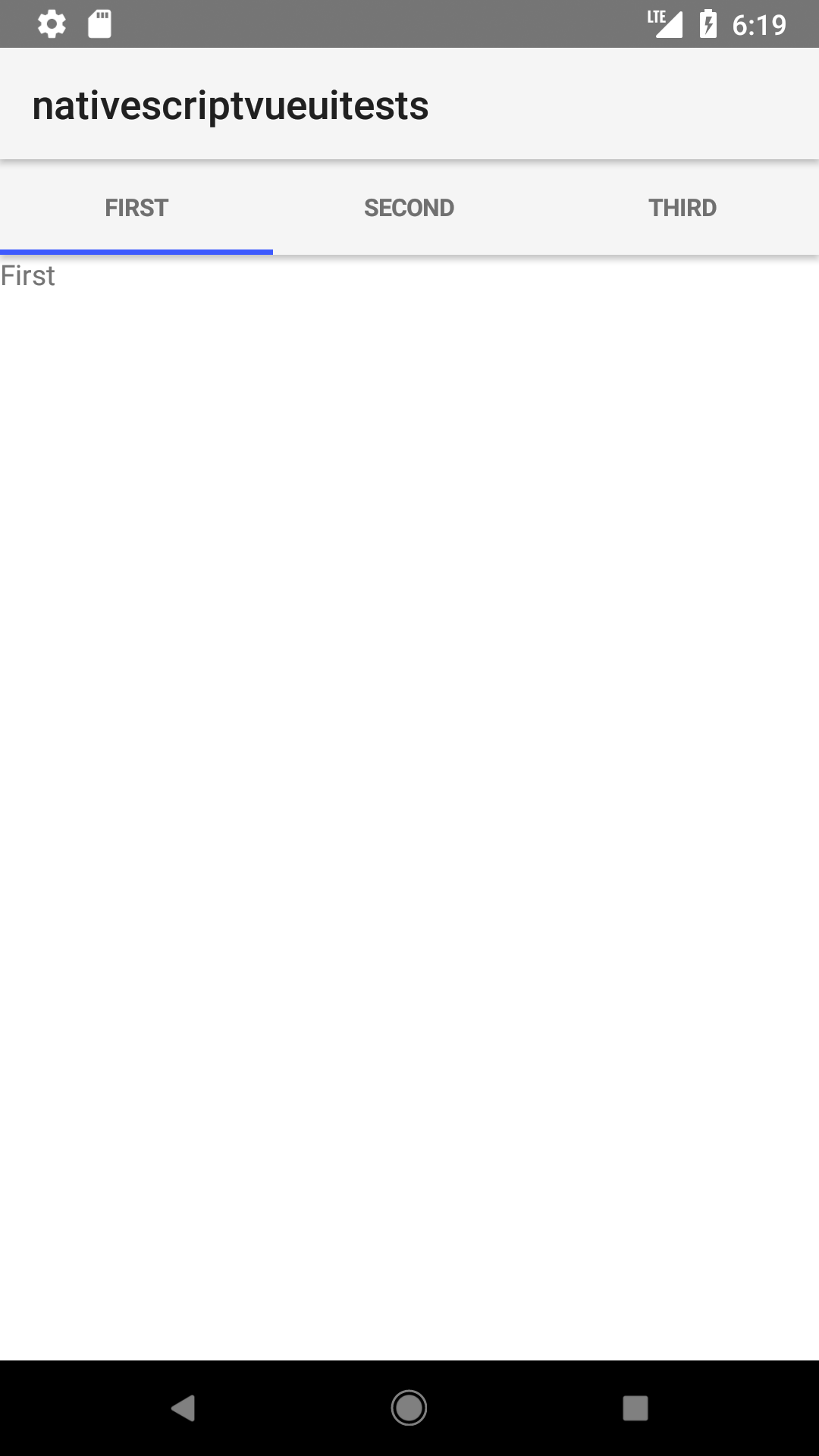
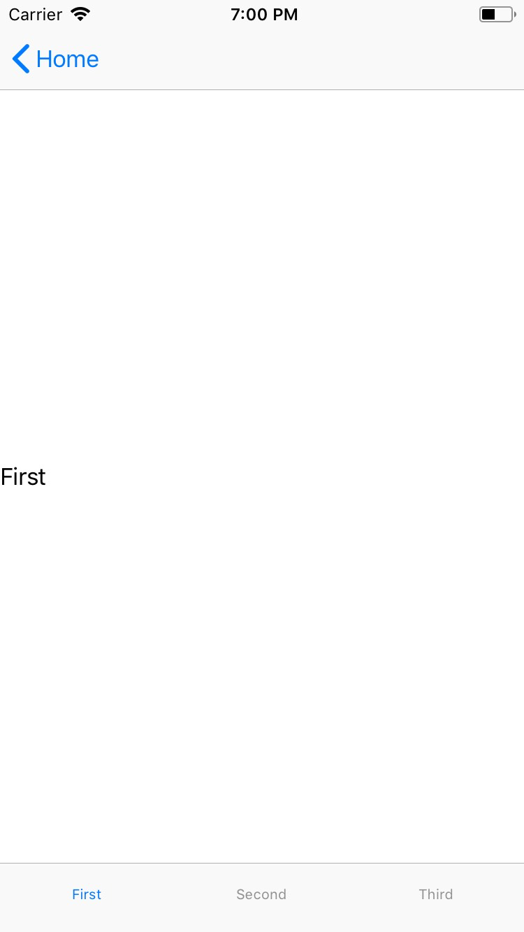
TabView
This is an overview of the most common usage of TabView. For more information about the available properties, methods, or events, head over to the complete API documentation for TabView.
<TabView> is a navigation component that shows content grouped into tabs and lets users switch between tabs.
<TabView :selectedIndex="selectedIndex">
  <TabViewItem title="Tab 1">
    <Label text="Content for Tab 1" />
  </TabViewItem>
  <TabViewItem title="Tab 2">
    <Label text="Content for Tab 2" />
  </TabViewItem>
</TabView>
NOTE: Currently, TabViewItem expects a single child element. In most cases, you might want to wrap your content in a layout.
Adding icons to tabs
<TabView :selectedIndex="selectedIndex" iosIconRenderingMode="alwaysOriginal">
  <TabViewItem title="Tab 1" iconSource="~/images/icon.png">
    <Label text="Content for Tab 1" />
  </TabViewItem>
  <TabViewItem title="Tab 2" iconSource="~/images/icon.png">
    <Label text="Content for Tab 2" />
  </TabViewItem>
</TabView>
NOTE: Use images for tab icons instead of icon fonts.
Props
| Name | Type | Description |
|---|---|---|
selectedIndex | Number | Gets or sets the currently selected tab. Default is 0. |
tabTextColor | Color | (Style property) Gets or sets the text color of the tabs titles. |
tabBackgroundColor | Color | (Style property) Gets or sets the background color of the tabs. |
selectedTabTextColor | Color | (Style property) Gets or sets the text color of the selected tab title. |
Events
| Name | Description |
|---|---|
tabChange | Emitted when one of the <TabViewItem> components is tapped. |
Native component
| Android | iOS |
|---|---|
android.support.v4.view.ViewPager | UITabBarController |
Contributors