You are reading docs for v1.3.1, click here for the latest version.
- introduction
- getting-started
- routing
- utilities
- elements:layouts
- elements:action-bar
- elements:components
- elements:dialogs
TextField
This is an overview of the most common usage of TextField. For more information about the available properties, methods, or events, head over to the complete API documentation for TextField.
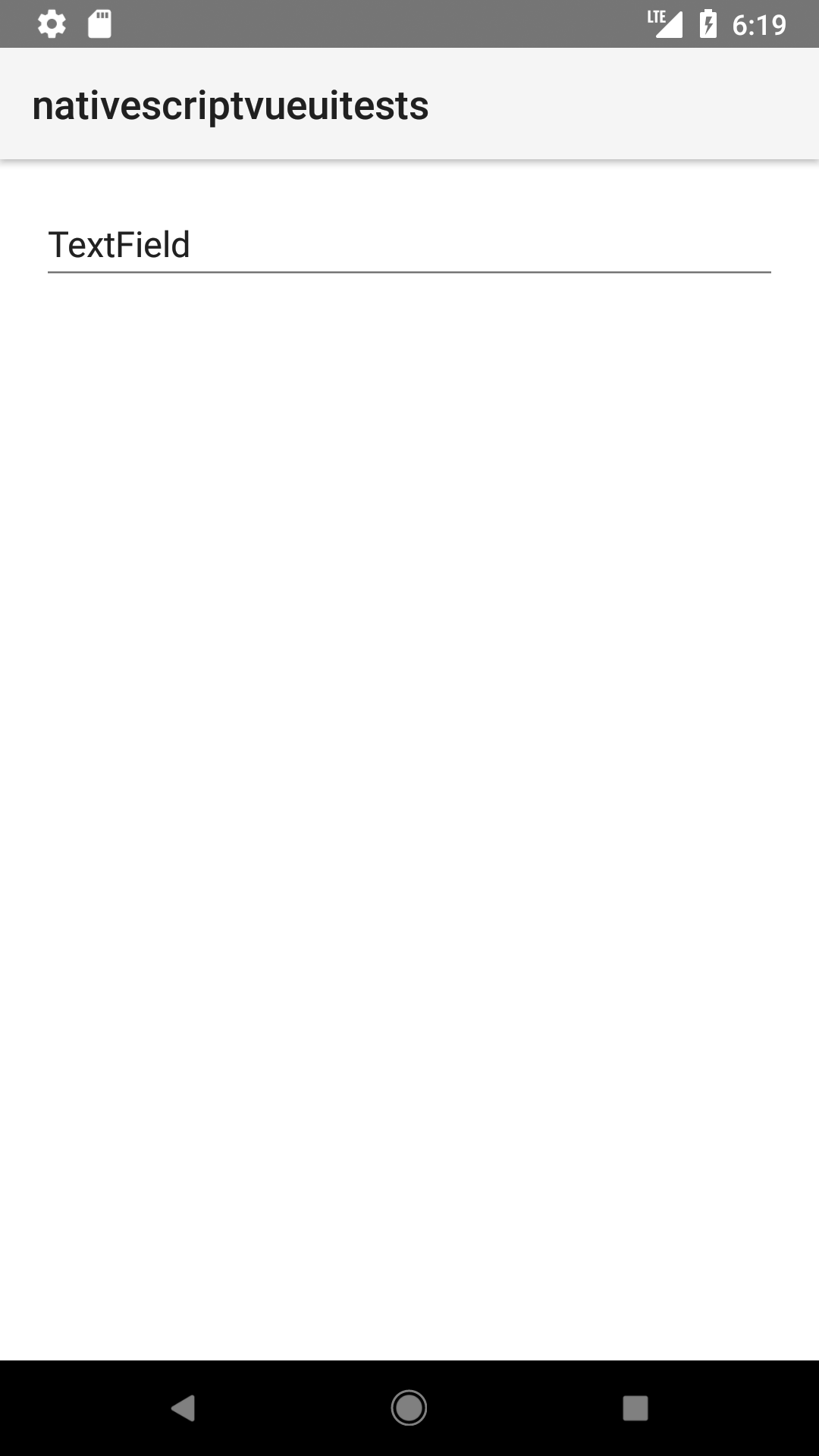
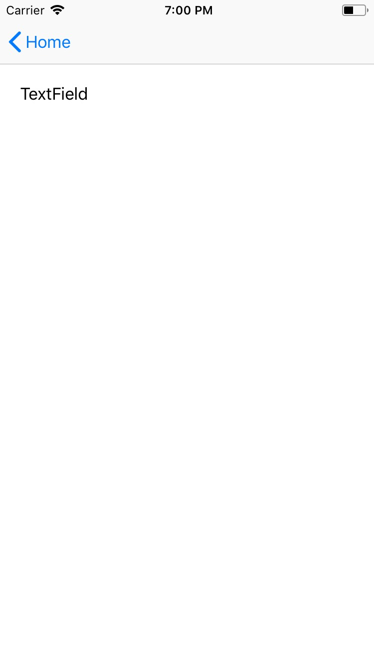
<TextField> is an input component that creates an editable single-line box.
<TextField> extends TextBase and EditableTextBase which provide additional properties and events.
<TextField :text="textFieldValue" hint="Enter text..." /><TextField> provdes two-way data binding using v-model.
<TextField v-model="textFieldValue" />

Props
| Name | Type | Description |
|---|---|---|
text | String | Gets or sets the value of the field. |
hint | String | Gets or sets the placeholder text. |
editable | Boolean | When true, indicates that the user can edit the value of the field. |
maxLength | Number | Limits input to the spcified number of characters. |
secure | Boolean | Hides the entered text when true. Use this property to create password input fields.Default value: false. |
keyboardType | KeyboardType | Shows a custom keyboard for easier text input. Valid values: datetime, phone, number, url, or email. |
returnKeyType | ReturnKeyType | Gets or sets the label of the return key. Valid values: done, next, go, search, or send. |
autocorrect | Boolean | Enables or disables autocorrect. |
Events
| Name | Description |
|---|---|
textChange | Emitted when the text changes. |
returnPress | Emitted when the return key is pressed. |
focus | Emitted when the field is in focus. |
blur | Emitted when the field loses focus. |
Native component
| Android | iOS |
|---|---|
android.widget.EditText | UITextField |
Contributors


