- introduction
- getting-started
- routing
- utilities
- elements:layouts
- elements:action-bar
- elements:components
- elements:dialogs
The NativeScript Playground is a place in the cloud where you can just play around with NativeScript and Vue.js from your browser until you figure out the basics. Fire the link and start dragging and dropping component code around the place.
You can work in the Playground for as long as you like. You can use it to just get a taste of NativeScript development or to develop your entire project inside. However, when you get to the point where you are ready to put your app out there, you need to jump on the more advanced wagon and install NativeScript tools locally and then pick a template to start with.
This page consists of two parts:
- The bare Vue.js template
- Basic design
- Basic functionality: Add tasks
- Basic functionality: View, complete, and delete tasks from the To Do tab
- Basic functionality: View, return to active tasks, and delete tasks from the Completed tab
- Advanced design: Styled input field and button
- Advanced design: Styled tab navigation
- Advanced design: Styled active tasks
- Advanced design: Styled completed tasks
Part 1: Getting familiar with the Playground
Firing this link gets you to a simple code editor in the cloud where a very basic NativeScript + Vue.js template is pre-loaded for you.
TIP: Head to Sample Tasks for the Playground for ideas about how to get started in the Playground.
Before you start
If this is your first time here, the Playground prompts you to install a couple of mobile apps—the NativeScript Playground and the NativeScript Preview. Together they let you see your code changes applied in real time on device. No code building and bundling required.
You can ignore this step but without it, you'll miss most of the fun and excitement of playing around with Vue.js and NativeScript.
Keep the apps running while you're experimenting with the code.
The lay of the land
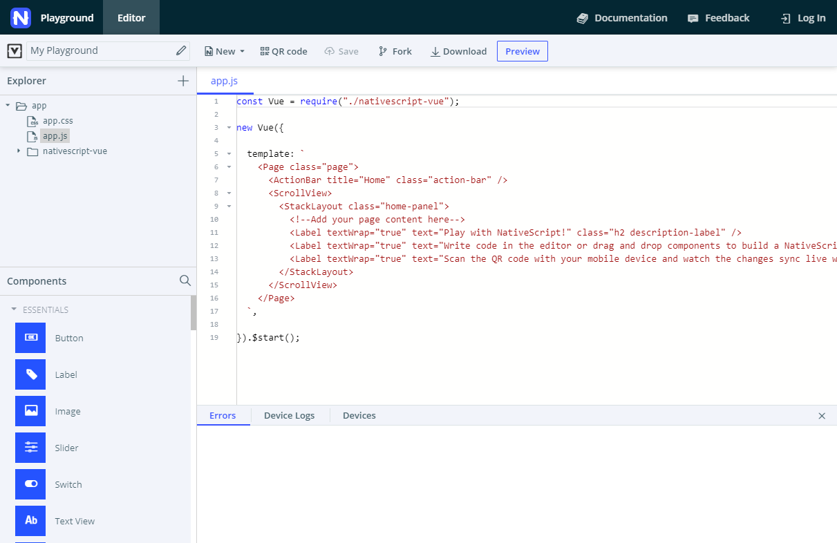
The left sidebar offers a file explorer and a Components panel. Most of your effort on your app will happen in components > HelloWorld.vue, where you'll be creating the user interface and the business logic behind it. No need to deep dive in any other files for now.
The Components panel provides quick access to already pre-configured code for all available NativeScript UI components.
From the top of the page, you can push changes to the preview apps on your device, save, and download your code.
The bottom of the page is your best friend providing real-time error reports and device logs.
Drag and drop to code
Just click a component from the Components panel and drag it to the code editor, somewhere inside the <template> block in components > HelloWorld.vue. Releasing the mouse button inserts some pre-written sample code for the respective component. Any methods that go with it (such as what happens on button or item tap) are automatically added right below in the <script> block.
TIP: Use the search of the Components panel to quickly find the element that you want to use. The search works only with the title of the component and not the actual name used in the code. For example: the search finds text field but does not find textfield.
For most UI components to work, you need to drop them inside the <Page> block, preferably inside a layout component. Layouts tell your app how to position the UI components on the screen.
NOTE: Right now, there's nothing stopping you from dropping the code at a place that will cause your app to crash or simply not load. In those cases, check the Errors and Device Logs tabs for more information.
Check it out real-time
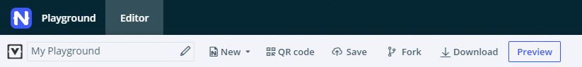
After you place the code in a valid spot, hit Preview (or Ctrl+S or Cmd+S) and see your app refresh on your device screen in an instant.
In some cases, when you interact with the app, it will close unexpectedly. Just fire it up again and inspect the crash report.
If at any point you stop seeing your changes applied on the device, click QR code and re-scan the QR code with the Playground app.
Configure your code
So, the component runs and shows on your screen. You're excited but you want to make it your own. Hack away at the default code suggested by the Playground. Fix sizes and labels, remove or add elements.
Scroll down to the <style scoped> block and switch up the styling a bit. Experiment with colors and font sizes.
Part 2: Building an app
If you want to explore the NativeScript Playground, you can start by creating a simple to-do app with the following requirements:
Basic design
- Two-tab layout
- One tab shows active tasks and lets you add new tasks
- Second tab lists completed tasks
Basic functionality
- Add tasks: Users can add tasks as text
- View tasks: Newly added tasks are listed as active and can be tapped
- Complete tasks: Tapping an active task shows an action dialog with options
- Delete tasks: Tapping an active or completed task shows an action dialog with options
Advanced design
- Input and button for adding tasks are styled
- Tabs are styled
- Active tasks are styled
- Completed tasks are styled
TIP: All sections of this tutorial contain a Some NativeScript basics and Requirement implementation sub-sections. You can skip the basics sub-section and jump straight to the implementation for a more hands-on approach.
The bare Vue.js template
All development for this tutorial happens in components > HelloWorld.vue, containing the front end, the code-behind logic, and most of the styles.
HelloWorld.vue begins with a simple <template> block consisting of several labels and no connected code-behind logic. As you drag and drop user interface components to the app, the Playground populates the <script> block.
You'll be working in the <template> block to design the user interface or in the <script> block to build the app functionality. The <template> block requires NativeScript-compatible XML. The <script> block accepts both Vue.js and NativeScript JavaScript code.
Basic design
Section progress
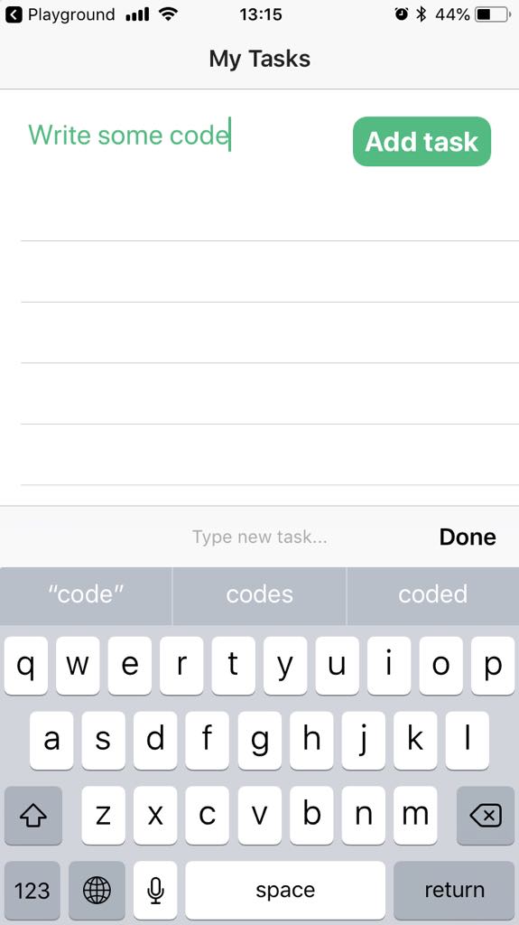
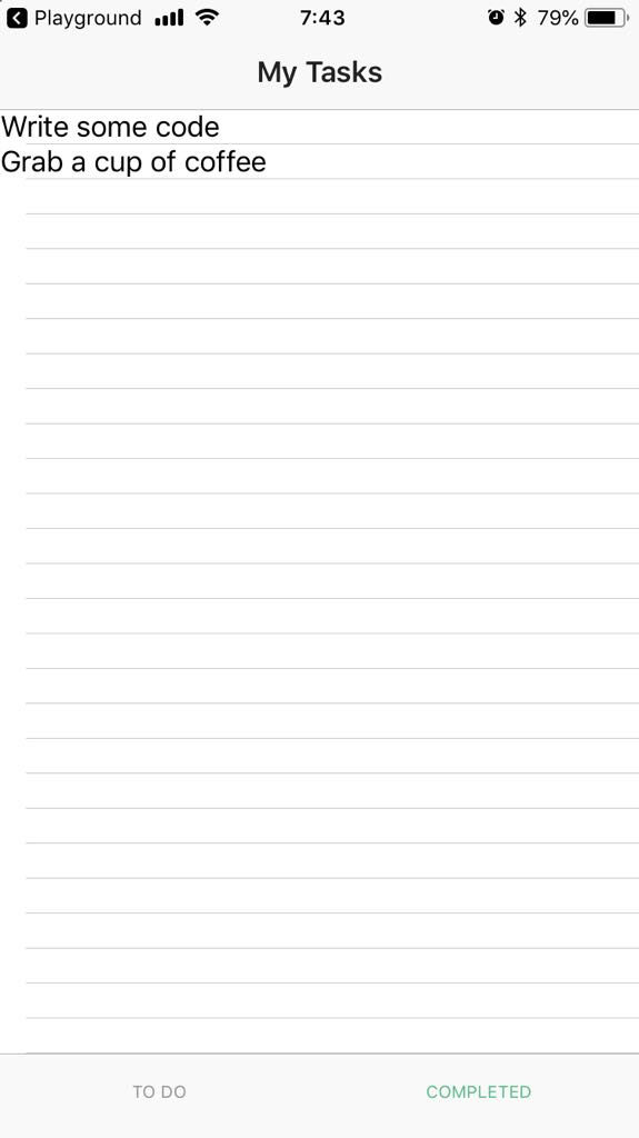
Here's how your app will look at the start and at the end of this section.
| Initial screen | Tab 1 | Tab 2 |
|---|---|---|
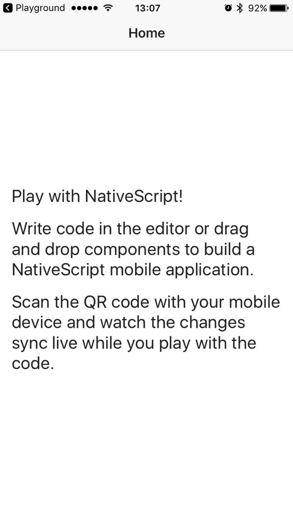 | 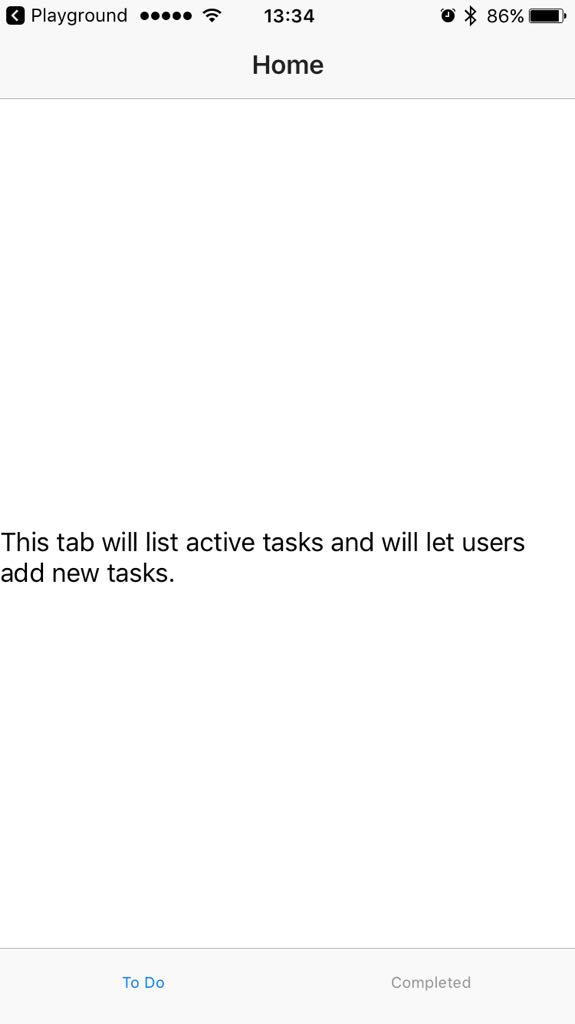 | 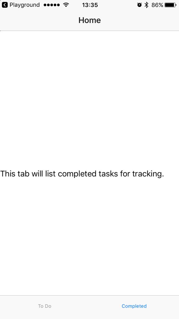 |
Some NativeScript basics
The <Page> element is the top-level user interface element of every NativeScript-Vue app. All other user interface elements are nested within.
The <ActionBar> element shows an action bar for the <Page>. A <Page> cannot contain more than one <ActionBar>.
Typically, after the <ActionBar>, you will have navigation components (such as a drawer or a tab view) or layout components. These elements control the layout of your app and let you determine how to place other user interface elements inside.
Requirement implementation
Use the <TabView> component to create a two-tab app.
- Change the title of the
<ActionBar>to reflect the app purpose. - Remove the default
<ScrollView>block and all its contents that come with the template.<ScrollView>components are top-level layout containers for scrollable content. - Drag and drop the
<TabView>component in its place.
The Playground applies some code formatting, including taking care of indentation. However, the formatting is applied after the insertion and using the browser's undo feature only reverts the formatting and not the insertion of code. - Configure the height of the
<TabView>to fill the screen (set it to 100%). - Change the titles of the
<TabViewItem>elements and their contents to reflect their purpose.
At this point, text content for the tabs is shown in<Label>components with no styling and formatting. Apply thetextWrap="true"property to the respective<Label>components to improve the visualization of the text.
At the end of this stage, your <HelloWorld.vue> should resemble this sample:
<template>
  <Page class="page">
    <ActionBar title="My Tasks" class="action-bar" />

    <TabView height="100%">
      <TabViewItem title="To Do">
        <Label text="This tab will list active tasks and will let users add new tasks." textWrap="true" />
      </TabViewItem>

      <TabViewItem title="Completed">
        <Label text="This tab will list completed tasks for tracking." textWrap="true" />
      </TabViewItem>

    </TabView>
  </Page>
</template>

<script>
export default {
  data () {
    return {
    };
  },
}
</script>

<style scoped>
.home-panel {
  vertical-align: center;
  font-size: 20;
  margin: 15;
}

.description-label {
  margin-bottom: 15;
}
</style>
Basic functionality: Add tasks
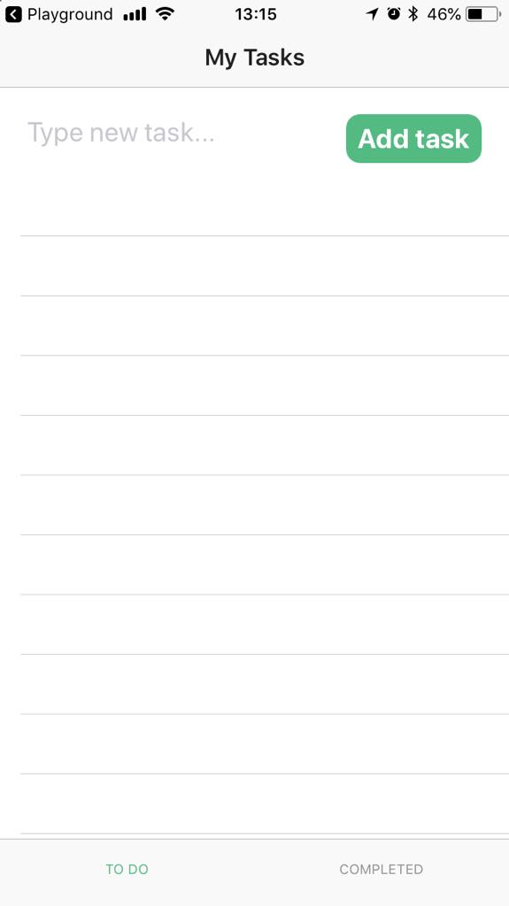
Section progress
Here's how your app will look at the start and at the end of this section.
| Initial screen | Tab 1 - No tasks | Tab 1 - Added tasks |
|---|---|---|
| 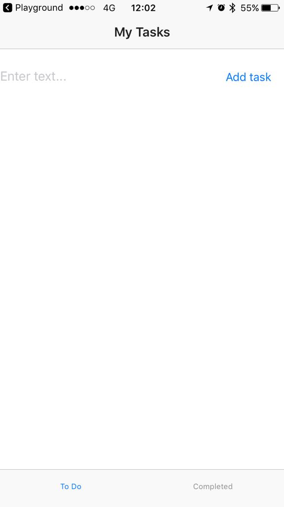 |  |
Some NativeScript basics
The layout components let you arrange the various UI widgets of your app. Whenever you need to place more than one UI widget on your app screen, you are likely to use one of the available layout options. The <StackLayout> and the <GridLayout> are basic but versatile options, letting you position elements vertically or in a table-like layout, respectively. While the <StackLayout> displays elements in their natural sequence, the <GridLayout> lets you choose the exact positions of your elements in the grid.
Requirement implementation
Use a <GridLayout> to arrange a <TextField> and a <Button> on the page. The latter two form the input functionality of the app.
Use a <ListView> to show tasks below the input field.
- Delete the
<Label>component from the first<TabViewItem>block for the first tab. - Drag and drop a
<StackLayout>component within the<TabViewItem>block for the first tab.
The default code creates a colorful vertical stack. - Delete all
<Label>components from the<StackLayout>block. - Drag and drop a
<GridLayout>component within the<StackLayout>block for the first tab.
The default code creates a colorful table that shows how to position elements and merge grid cells. - Delete all
<Label>components from the<GridLayout>block. Configure the
<StackLayout>.- Remove background color.
- Set width and height.
Configure the
<GridLayout>.- Set the grid to consist of two columns and one row.
- Set the width of the grid to 100% so that it takes the entire width of the screen.
- Set the height of the grid to 25%. Otherwise, the
<ListView>you'll be adding later might overlap the<GridLayout>. - Remove any additional settings for the grid.
- Drag and drop a
<TextField>and a<Button>within the<GridLayout>block.
The Playground adds JavaScript code to your code for the first time. Note thedata()andmethodsblocks added in the<script>block below. In next implementation steps, you will need to add code to these sections to create some of the app functionality. - Drag and drop a
<ListView>below the grid.
The default code creates a list of countries and country flag icons within a<FlexboxLayout>. Configure the positioning of the elements within the grid.
- Set the
<TextField>to inhabit the first column and the first row. - Set the
<Button>to inhabit the second column and the first row.
- Set the
Configure the
<TextField>.- Make the text field editable.
- Enable adding tasks using
Returnfrom the keyboard.
Clean up and configure the
<ListView>.- Remove all its nested blocks except for the
<Label>. - Set its height to 75%. Otherwise, the
<ListView>might overlap the<GridLayout>. - Replace the
countries-related binding with a binding to your array of active tasks. - In the
<script>block, remove the array of countries and create an empty array for your active tasks.
- Remove all its nested blocks except for the
In the
<scripts>block, tie some logic to the tapping of the button.- Log newly added tasks in the console.
- Add newly added tasks into the array of active tasks. Use
unshiftto place new items at the top of the page. - Clear the text field after input.
- Use the
<Label>in the<ListView>to list the newly added task on the screen.
At the end of this stage, your <HelloWorld.vue> should resemble this sample:
<template>
<Page class="page">
<ActionBar title="My Tasks" class="action-bar" />
<TabView height="100%">
<TabViewItem title="To Do">
<!-- Positions an input field, a button, and the list of tasks in a vertical stack. -->
<StackLayout orientation="vertical" width="100%" height="100%">
<GridLayout columns="2*,*" rows="*" width="100%" height="25%">
<!-- Configures the text field and ensures that pressing Return on the keyboard produces the same result as tapping the button. -->
<TextField col="0" row="0" v-model="textFieldValue" hint="Type new task..." editable="true" @returnPress="onButtonTap" />
<Button col="1" row="0" text="Add task" @tap="onButtonTap" />
</GridLayout>
<ListView class="list-group" for="todo in todos" @itemTap="onItemTap" style="height:75%">
<v-template>
<Label :text="todo.name" class="list-group-item-heading" />
</v-template>
</ListView>
</StackLayout>
</TabViewItem>
<TabViewItem title="Completed">
<Label text="This tab will list completed tasks for tracking." textWrap="true" />
</TabViewItem>
</TabView>
</Page>
</template>
<script>
export default {
methods: {
onItemTap: function(args) {
console.log('Item with index: ' + args.index + ' tapped');
},
onButtonTap() {
console.log("New task added: " + this.textFieldValue + "."); // Logs the newly added task in the console for debugging.
this.todos.unshift({ name: this.textFieldValue }); // Adds tasks in the ToDo array. Newly added tasks are immediately shown on the screen.
this.textFieldValue = ""; // Clears the text field so that users can start adding new tasks immediately.
},
},
data() {
return {
todos: [],
textFieldValue: "",
};
},
}
</script>
<style scoped>
.home-panel {
vertical-align: center;
font-size: 20;
margin: 15;
}
.description-label {
margin-bottom: 15;
}
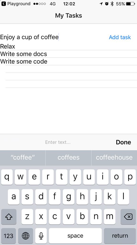
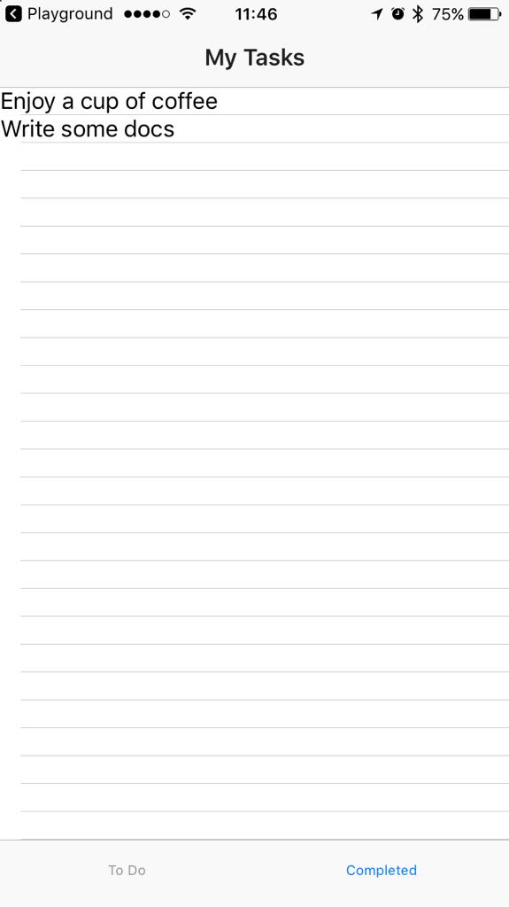
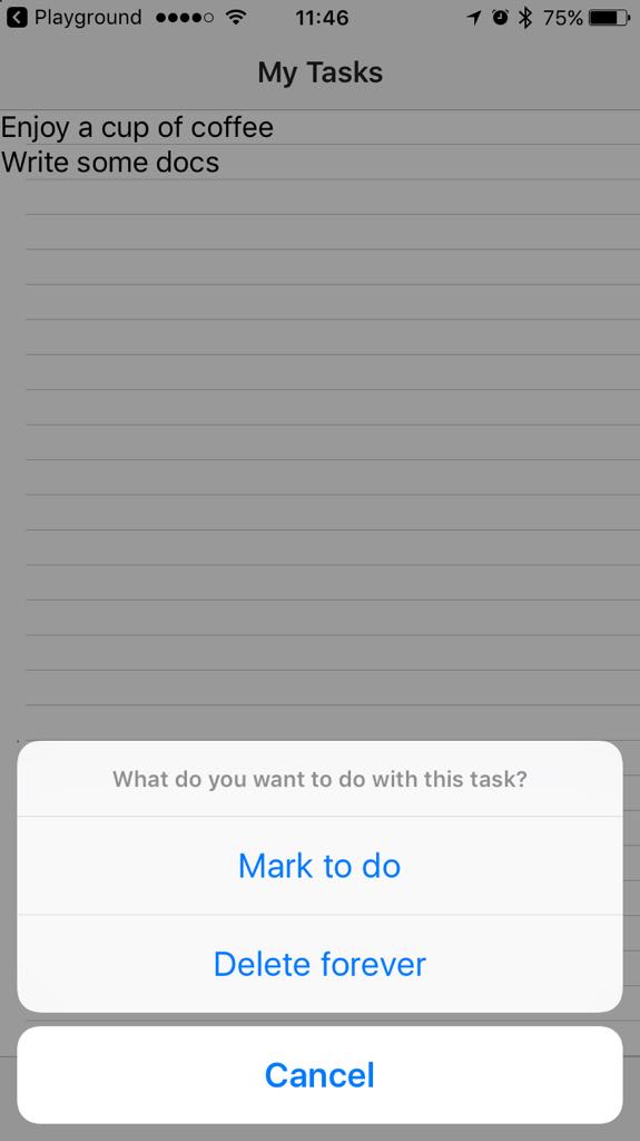
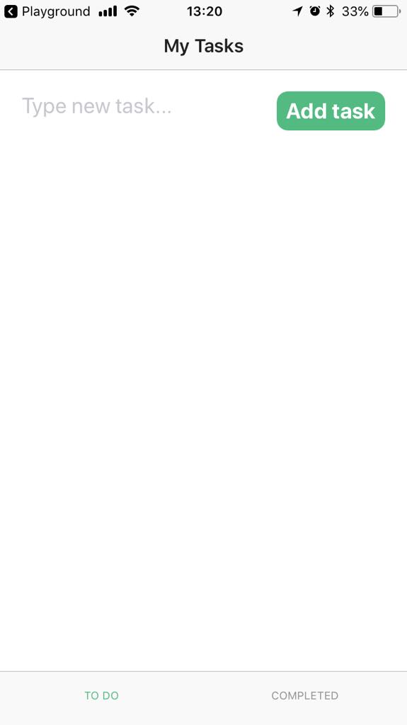
</style>Basic functionality: View, complete, and delete tasks from the To Do tab
Section progress
Here's how your app will look at the start and at the end of this section.
| Tab 1 - Added tasks | Tab 1 - Item tapped | Tab 2 - Completed tasks |
|---|---|---|
|  |  |
Some NativeScript basics
Out-of-the-box, the <ListView> component detects a tap gesture for every item and emits an event for it. The event carries information about the index of the tapped array item and the array item itself. To let the user choose the outcome of a tap gesture and expand the functionality of your app, you can tie a dialog to the event.
dialogs is a globablly available module that provides several configurable dialog types for apps: alert, action, prompt, login, confirmation. This implementation relies on action() to let the user choose if they want to mark a task as completed or delete it from the list of active tasks.
Requirement implementation
In the second
<TabViewItem>block, remove the<Label>element. Drag and drop a<ListView>element, clean up its contents and set a height for it.In the newly added
<ListView>element show items from an array of completed tasks (dones).<ListView class="list-group" for="done in dones" @itemTap="onDoneTap" style="height:75%"> <v-template> <Label :text="done.name" class="list-group-item-heading" /> </v-template> </ListView>Modify the
onItemTapmethod.
Method shows an
action()dialog.Method logs user selection in the console for debugging.
Based on user selection, the method moves elements from the
todosarray to thedonesarray, deletes elements from thetodosarray, or dismisses the dialog. Usesplice()to avoid leaving holes in the array andunshift()to make sure that recently completed tasks are shown on top.onItemTap: function(args) { action('What do you want to do with this task?', 'Cancel', ['Mark completed', 'Delete forever']) .then(result => { console.log(result); // Logs the selected option for debugging. switch (result) { case 'Mark completed': this.dones.unshift(args.item); // Places the tapped active task at the top of the completed tasks. this.todos.splice(args.index, 1); // Removes the tapped active task. break; case 'Delete forever': this.todos.splice(args.index, 1); // Removes the tapped active task. break; case 'Cancel' || undefined: // Dismisses the dialog break; } }) },
At the end of this stage, your <HelloWorld.vue> should resemble this sample:
<template>
<Page class="page">
<ActionBar title="My Tasks" class="action-bar" />
<TabView height="100%">
<TabViewItem title="To Do">
<!-- Positions an input field, a button, and the list of tasks in a vertical stack. -->
<StackLayout orientation="vertical" width="100%" height="100%">
<GridLayout columns="2*,*" rows="*" width="100%" height="25%">
<!-- Configures the text field and ensures that pressing Return on the keyboard produces the same result as tapping the button. -->
<TextField col="0" row="0" v-model="textFieldValue" hint="Type new task..." editable="true" @returnPress="onButtonTap" />
<Button col="1" row="0" text="Add task" @tap="onButtonTap" />
</GridLayout>
<ListView class="list-group" for="todo in todos" @itemTap="onItemTap" style="height:75%">
<v-template>
<Label :text="todo.name" class="list-group-item-heading" />
</v-template>
</ListView>
</StackLayout>
</TabViewItem>
<TabViewItem title="Completed">
<ListView class="list-group" for="done in dones" @itemTap="onItemTap" style="height:75%">
<v-template>
<Label :text="done.name" class="list-group-item-heading" />
</v-template>
</ListView>
</TabViewItem>
</TabView>
</Page>
</template>
<script>
export default {
methods: {
onItemTap: function(args) {
action('What do you want to do with this task?', 'Cancel', ['Mark completed', 'Delete forever'])
.then(result => {
console.log(result); // Logs the selected option for debugging.
switch (result) {
case 'Mark completed':
this.dones.unshift(args.item); // Places the tapped active task at the top of the completed tasks.
this.todos.splice(args.index, 1); // Removes the tapped active task.
break;
case 'Delete forever':
this.todos.splice(args.index, 1); // Removes the tapped active task.
break;
case 'Cancel' || undefined: // Dismisses the dialog.
break;
}
})
},
onButtonTap() {
console.log("New task added: " + this.textFieldValue + "."); // Logs the newly added task in the console for debugging.
this.todos.unshift({
name: this.textFieldValue
}); // Adds tasks in the ToDo array. Newly added tasks are immediately shown on the screen.
this.textFieldValue = ""; // Clears the text field so that users can start adding new tasks immediately.
},
},
data() {
return {
dones: [],
todos: [],
textFieldValue: "",
};
},
}
</script>
<style scoped>
.home-panel {
vertical-align: center;
font-size: 20;
margin: 15;
}
.description-label {
margin-bottom: 15;
}
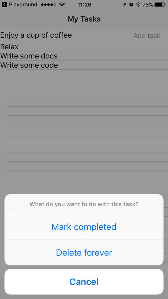
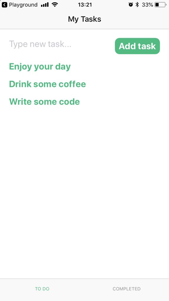
</style>Basic functionality: View, return to active tasks, and delete tasks from the Completed tab
Section progress
Here's how your app will look at the start and at the end of this section.
| Tab 2 - Completed tasks | Tab 2 - Item tapped | Tab 1 - Active tasks |
|---|---|---|
 |  | 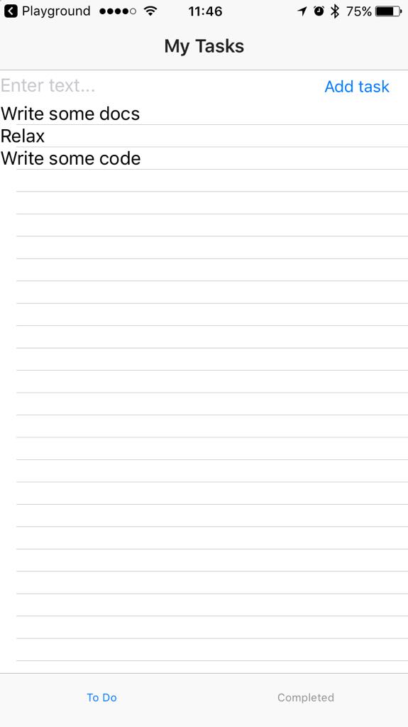 |
Some NativeScript basics
This implementation step does not require any additional knowledge.
Requirement implementation
For the second tab, create and modify the onDoneTap method:
Method shows an
action()dialog.Method logs user selection in the console for debugging.
Based on user selection, the method moves elements from the
donesarray to thetodosarray, deletes elements from thedonesarray, or dismisses the dialog. Usesplice()to avoid leaving holes in the array andunshift()to make sure that recently completed tasks are shown on top.onDoneTap: function(args) { action('What do you want to do with this task?', 'Cancel', ['Mark to do', 'Delete forever']) .then(result => { console.log(result); // Logs the selected option for debugging. switch (result) { case 'Mark to do': this.todos.unshift(args.item); // Places the tapped completed task at the top of the to do tasks. this.dones.splice(args.index,1); // Removes the tapped completed task. break; case 'Delete forever': this.dones.splice(args.index, 1); // Removes the tapped completed task. break; case 'Cancel' || undefined: // Dismisses the dialog break; } }) },
At the end of this stage, your <HelloWorld.vue> should resemble this sample:
<template>
<Page class="page">
<ActionBar title="My Tasks" class="action-bar" />
<TabView height="100%">
<TabViewItem title="To Do">
<!-- Positions an input field, a button, and the list of tasks in a vertical stack. -->
<StackLayout orientation="vertical" width="100%" height="100%">
<GridLayout columns="2*,*" rows="*" width="100%" height="25%">
<TextField col="0" row="0" v-model="textFieldValue" hint="Type new task..." editable="true" @returnPress="onButtonTap" />
<!-- Configures the text field and ensures that pressing Return on the keyboard produces the same result as tapping the button. -->
<Button col="1" row="0" text="Add task" @tap="onButtonTap" />
</GridLayout>
<ListView class="list-group" for="todo in todos" @itemTap="onItemTap" style="height:75%">
<v-template>
<Label :text="todo.name" class="list-group-item-heading" />
</v-template>
</ListView>
</StackLayout>
</TabViewItem>
<TabViewItem title="Completed">
<ListView class="list-group" for="done in dones" @itemTap="onDoneTap" style="height:75%">
  <v-template>
    <Label :text="done.name" class="list-group-item-heading" />
  </v-template>
</ListView>
</TabViewItem>
</TabView>
</Page>
</template>
<script>
export default {
methods: {
onItemTap: function(args) {
  action('What do you want to do with this task?', 'Cancel', ['Mark completed', 'Delete forever'])
    .then(result => {
      console.log(result); // Logs the selected option for debugging.
      switch (result) {
        case 'Mark completed':
          this.dones.unshift(args.item); // Places the tapped active task at the top of the completed tasks.
          this.todos.splice(args.index, 1); // Removes the tapped active  task.
          break;
        case 'Delete forever':
          this.todos.splice(args.index, 1); // Removes the tapped active task.
          break;
        case 'Cancel' || undefined: // Dismisses the dialog
          break;
      }
    })
},
onDoneTap: function(args) {
  action('What do you want to do with this task?', 'Cancel', ['Mark to do', 'Delete forever'])
    .then(result => {
      console.log(result); // Logs the selected option for debugging.
      switch (result) {
        case 'Mark to do':
          this.todos.unshift(args.item); // Places the tapped completed task at the top of the to do tasks.
          this.dones.splice(args.index,1); // Removes the tapped completed task.
          break;
        case 'Delete forever':
          this.dones.splice(args.index, 1); // Removes the tapped completed task.
          break;
        case 'Cancel' || undefined: // Dismisses the dialog
          break;
      }
    })
},
onButtonTap() {
console.log("New task added: " + this.textFieldValue + "."); // Logs the newly added task in the console for debugging.
this.todos.unshift({
name: this.textFieldValue
}); // Adds tasks in the ToDo array. Newly added tasks are immediately shown on the screen.
this.textFieldValue = ""; // Clears the text field so that users can start adding new tasks immediately.
},
},
data() {
return {
dones: [],
todos: [],
textFieldValue: "",
};
},
}
</script>
<style scoped>
.home-panel {
vertical-align: center;
font-size: 20;
margin: 15;
}
.description-label {
margin-bottom: 15;
}
</style>Advanced design: Styled input field and button
Section progress
Here's how your app will look at the start and at the end of this section.
| Tab 1 - No style | Tab 1 - Styled | Tab 1 - Styled |
|---|---|---|
| 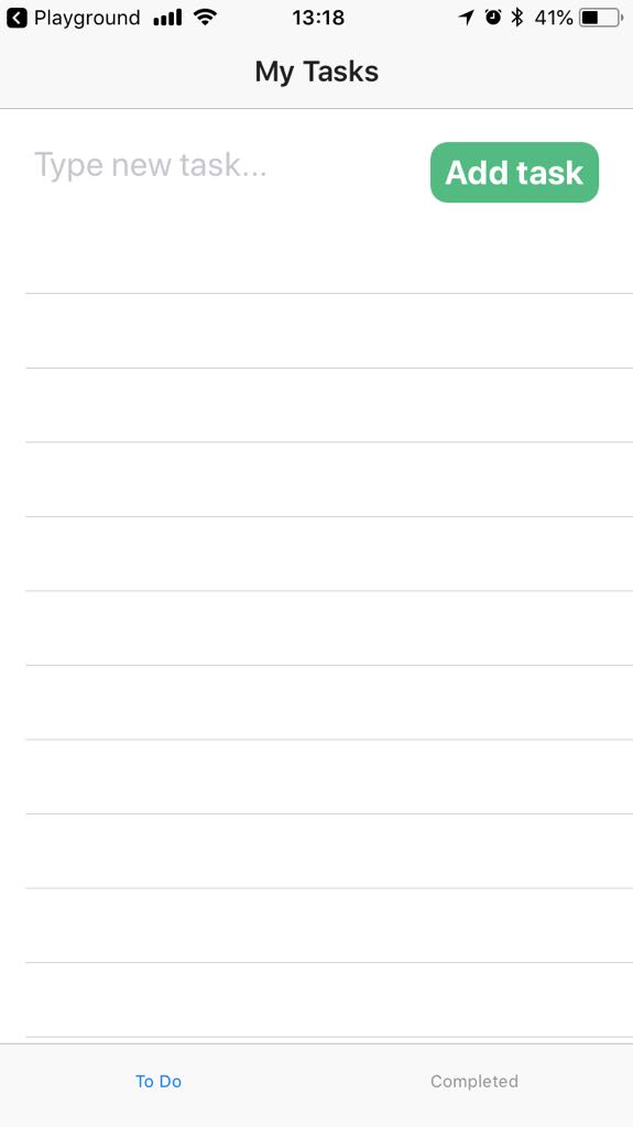 |  |
Some NativeScript basics
When you work with NativeScript and Vue.js, you can use application-wide CSS, scoped CSS, or inline CSS to style your app. Application-wide CSS is applied first and is handled in app.css in the root of your project. This tutorial does not explore application-wide CSS. See also: Styling.
Scoped CSS is applied to the current component only and is handled in HelloWorld.vue in the <style scoped> block. This tutorial relies almost exclusively on scoped CSS and inline CSS. See also: Scoped CSS.
With type selectors, you can select a UI component and apply styling to it. To select a type, use the component name as provided in the code. For example, to select the tab view, use TabView.
Requirement implementation
Style the input field
In HelloWorld.vue > <style scoped>, change the font size, the color, and the margins around the <TextField>.
TextField {
  font-size: 20;
  color: #53ba82;
  margin-top: 10;
  margin-bottom: 10;
  margin-right: 5;
  margin-left: 20;
}
Style the button
In the <style scoped> block, create a style for the button. Modify the style to create a colorful button with rounded corners.
Button {
  font-size: 20;
  font-weight: bold;
  color: white;
  background-color: #53ba82;
  height: 40;
  margin-top: 10;
  margin-bottom: 10;
  margin-right: 10;
  margin-left: 10;
  border-radius: 20px;
}
Advanced design: Styled tab navigation
Section progress
Here's how your app will look at the start and at the end of this section.
| Tabs - No style | Tabs Styled |
|---|---|
|  |
Some NativeScript basics
<TabView> provides some styling properties out of the box. You can apply a text transform to each tab title (textTransform) and change the font size and color globally (tabTextFontSize, tabTextColor, selectedTabTextColor). You can also change the background color of your tabs (tabBackgroundColor).
Requirement implementation
Change color and font size of selected tab title
In HelloWorld.vue, add the selectedTabTextColor and tabTextFontSize property to the <TabView>.
<TabView height="100%" selectedTabTextColor="#53ba82" tabTextFontSize="15" >Transform text
Apply the textTransform property to the separate tabs. You can use this property only on the <TabViewItem> level.
<TabViewItem title="To Do" textTransform="uppercase" ><TabViewItem title="Completed" textTransform="uppercase">Advanced design: Styled active tasks
Here's how your app will look at the start and at the end of this section.
| Active tasks - No style | Active tasks - no separator | Active tasks - styled active tasks |
|---|---|---|
|  |  |
Some NativeScript basics
<ListView> and <Label> have out-of-the-box style properties that you can use to control elements such as the list separator or the text wrap within the <template> block. To change the font style, color, and positioning of text, you need to use CSS in the <style scoped> block.
To implement a style particularly for the text of active tasks, you can set an id for the <Label> element.
Requirement implementation
Set an
idfor the<Label>that represents active tasks and enable text wrapping. Enabling text wrapping ensures that longer text shows properly in your list<Label id="active-task" :text="todo.name" class="list-group-item-heading" />Add the
separatorColorproperty and set it totransparentfor the<ListView>that shows active tasks. This way, the separator will no longer appear in your list.<ListView class="list-group" for="todo in todos" @itemTap="onItemTap" style="height:75%" separatorColor="transparent" >In
<style scoped>, create the style for active tasks. Set font size, color, and some padding to position the text on the page. Play with margins and paddings until you get a result that works for you.#active-task { font-size: 20; font-weight: bold; color: #53ba82; margin-left: 20; padding-top: 5; padding-bottom: 10; }
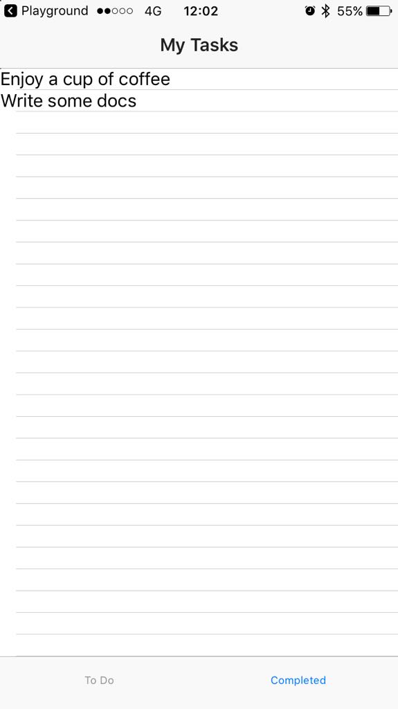
Advanced design: Styled completed tasks
Here's how your app will look at the start and at the end of this section.
| Completed tasks - No style | Completed tasks - Styled |
|---|---|
 | 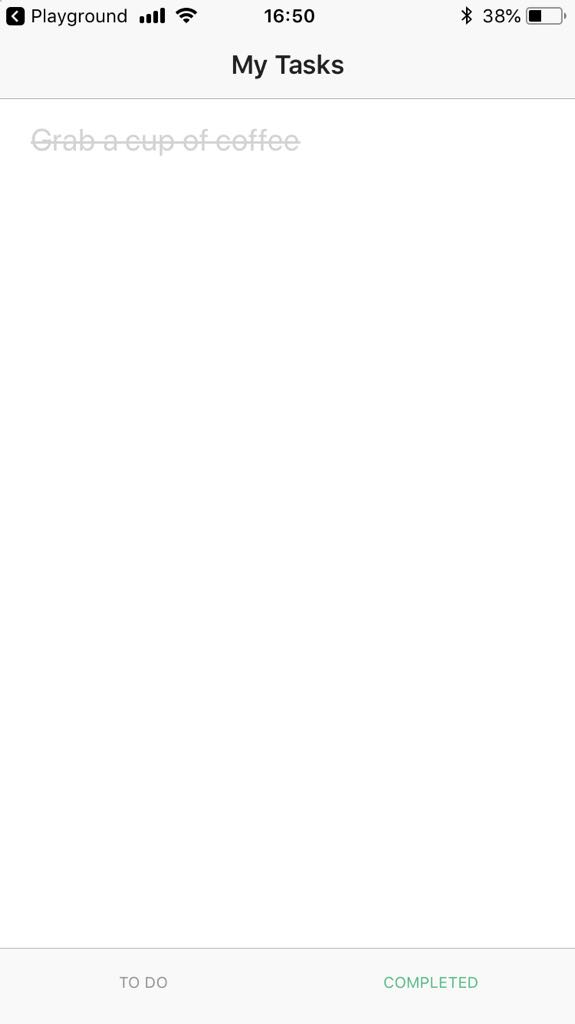 |
Some NativeScript basics
This section applies the basic NativeScript knowledge from Advanced design: Styled active tasks.
Requirement implementation
Set an
idfor the<Label>that represents completed tasks and enable text wrapping. Enabling text wrapping ensures that longer text shows properly in your list<Label id="completed-task" :text="done.name" class="list-group-item-heading" />Add the
separatorColorproperty, and set it totransparentfor the<ListView>that represents completed tasks. This way, the separator will no longer appear in your list.<ListView id="completed-list" class="list-group" for="done in dones" @itemTap="onDoneTap" style="height:75%" separatorColor="transparent">In
<style scoped>, create the style for completed tasks. Set font size, color, text decoration, and some padding to position the text on the page. Play with margins and paddings until you get a result that works for you.#completed-task { font-size: 20; color: #d3d3d3; margin-left: 20; padding-top: 5; padding-bottom: 10; text-decoration: line-through; }